Friday, 25 April 2014

"Treasure Island" by Robert Louis Stevenson

So far most of my collages haven't been very 'boyish', so I decided to pick a book that offered imagery that would appeal to a male and female audience. "Treasure Island" by Robert Louis Stevenson is never been a book that I've particularly been aware of, the only reason I recognised the name when researching was because of Muppet adaptation that I saw as a child. I will admit that I didn't read this book, as reading about pirates and treasure islands does not interest me in the slightest, however I did do a lot of reading on the internet to get a good idea of the book. With this book the imagery was always going to be the obvious pirate themed things as I expected. Below are some quick notes and ink drawings to get me started.


I like this collage as it is slightly different to the others. Although I have been using the same printed sheets of paper that I made at the start, the colour pallet for this collage does differ to the others. I feel like the use of reds and blues does give this collage a slightly more boyish theme. I want my work to appeal to a wide audience of all ages and genders.


Monday, 21 April 2014

"Alice In Wonderland" by Lewis Carroll

"Alice in Wonderland" by Lewis Carroll has always been a book that I've wanted to read. I read this book from start to finish as I enjoyed it as soon as I started reading it. Some parts were a bit boring but being a book based on a fantasy world I found that reading about the imagery was exciting and I could imagine how I wanted some of the objects/characters to look already. Below are a few quick sketches and the majority of the original collages before I compiled them.


Sorry about the quality of these, I screen shotted them a bit too small. So far this is probably my favourite collage. The colours, strange objects and characters make the collage look bit more chaotic compared to the Jungle book collage for example.


Friday, 11 April 2014

Collages as a Collection

This is just a quick post to consider how the images look like together as a collection so far. Firstly are the collages without a background, then below are the collages with coloured backgrounds. I really do not like The Iron Man collage (the car collage) with a background, as I feel like it ruins the colours. I will have to see if there is any other colours that would suit the image. However, the Frankenstein collage looks a bit empty without a background, and I can't quite work out if that is a good thing or a bad thing. As for The Jungle Book collage, I quite like both versions. When I come towards the end of creating all my collages I will be able to place them all together, with and without backgrounds, and maybe select which I prefer, or maybe have a mixture of some with and without.


'The Jungle Book' by Rudyard Kipling

For my next booked I decided to pick 'The Jungle Book' by Rudyard Kipling. I chose this book as my favourite collage from negotiated study was the scene with the lion in the jungle. Designing all the flowers and plants was something I really enjoyed.
I have never read The Jungle Book, so at first I had the disney film in my head. However my Mum explained to me that the book was actually a collection of short stories. My Mum has a book called 'ANIMAL STORIES' by Rudyward Kipling that my Grandad bought her in 1967. The book happened to contain a few of the short stories from 'The Jungle Book' so I had a little read of some of them.


Seeing as there was so many stories to try and include, I decided to chose three of the main animals that appeared in the stories. Snakes are often the main antagonists, as well as the bengal tiger. The sloth bear is an important character so he will also be included. I wanted to keep the design simple but quite chaotic to represent the density of the jungle. Below is my individual collages for this book. 


The quality isn't great as I have screen shotted the image on photoshop, as the files are way too large to upload on to here. I began to arrange these items on an A3 file, below are the results, yet again one with a background and one without. 


So far this is my favourite collage I think. It is my favourite because the colours are vibrant and bold, and it has a strong decorative feel to it. I also like the characters, especially the sloth bear and the cobra, the bear looks quite charming in the middle, whilst the snake looks threatening in the corner. I think this collage will look good when it has been professionally printed out.  

Tuesday, 8 April 2014

The Iron Man collage changes

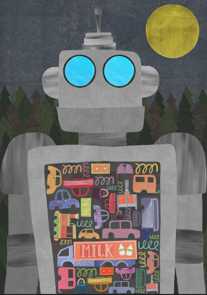
Before the easter holidays I had my formative assessment with Jonny and Louise. The meeting went well (I think) apart from the expected comments of how I need to speed up the pace and create more collages. Jonny pointed out that the mountains and pine trees didn't suit the english setting of 'The Iron Man', and him and Louise commented on how they liked the images where I had simply placed my individual pieces of collage on to a blank canvas. So with this in mind, I decided that I absolutely hated The Iron Man collage and reworked it/started from scratch. Below are the two finished images, one with no background, and one with a grey background with pipes, to create the idea that you are looking at the contents of the giants stomach.


Wednesday, 2 April 2014

The Iron Man collage progression

 Things have been moving slow recently. Today I realised that it doesn't matter if I produce a collage that I might not chose to display for the degree show, every bit of work counts towards my mark, and I shouldn't lose hope in things as not all of it will have to be seen by the public. The thought of the degree show has been hindering my creativeness slightly I think, but i'm feeling positive and a bit more determined to get it all done over easter.

Over the past few days I have been working on my collage for 'The Iron Man' by Ted Hughes. I decided to do a crop in of the giant, showing the contents of his stomach. In the book there is a list of all the metal things that he likes to eat in the scarp yard, including steam engines, cars, springs, cookers, bedsteads vans etc.

Instead of doing the cars all the same colour aka grey and rusty, I thought it might be good to play around with colour. I thought that this will give the image a more playful, contemporary touch, seeing as the giant is tones of grey and quite a simplistic shape. I wanted to make the metal objects exciting and colourful to make sure that my imagery is consistent and coincides with one and other if shown as a collection. Below are my scanned in images of the metal objects for the iron mans stomach.


In the book, the iron man travels to kill the sky serpent, so I decided to chose a scenery that can be universally linked to many different places. Below is my first attempt at the collage on photoshop. I decided that the bright green trees and bright blue sky was all a bit too typical and predictive, and also the grey wasn't really standing out on top of the textured green trees. So, I decided to try and change the scenery to make the image more intriguing.

Attempt no.1 - Iron Man in the day time (stomach incomplete)


Above are the final images, one with mountains and one without. I do like these images, but there is something not quite right. I think it might be the flatness of the Iron Man. I have a tutorial this week with Louise and Jonny so hopefully they'll be able to help me out.