Monday, 24 March 2014

"The Iron Man" by Ted Hughes

For my next collage I have decided to create my own portrayal of 'The Iron Man' by Ted Hughes. I had never read this book, I have only seen the adaptation film 'The Iron Giant'. The book was very quick and easy to read, and very different to the film. Below are some notes I made whilst reading.


The description of the scene where the family is sitting on the hill that is on top of the Iron Mans grave was one I particularly liked, however I would like to include more of the iron giants body/face in my 
final. 


For this collage I want to do a crop in of what would be a larger scene. In the book there was a long list of all different metal objects that the iron man could eat in the scrap yard, so I want to create a collage including all those items piled up in his stomach.


Frankenstein Development

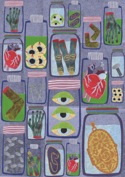
In my previous post about my Frankenstein collage I wrote about how I liked the collage without a background...well I put a background on it and preferred it a lot more. It took two seconds and improved the collage. It has made the whole image a bit darker, which suits the themes of the book. 


Some of the lighter colours look a bit lost, so I decided to fill some of the jars with white.


I like the way the flat white background is quite disjointed. It allows the lighter coloured collages to stand out a bit more. I am going to leave this collage for now as I am quite happy with it, and take it in to show a tutor to see what they think about it this week. 


Thursday, 20 March 2014

Examples of Book Branding/Editions/Collections/Volumes

I need to start considering what sort of branding I am going to use on all of my posters. The 'Wilks Paper Back Collection' doesn't quite have a ring to it, so I would have to come up with another word/name other than Wilks. Jonny showed me the Faber and Faber books called the "Faber Paper-covered Editions". These books all feature a banner down the right hand side of the book cover. Below are a few examples. The simple font on plain different coloured backgrounds looks classic and stylish. 


Another good example of a publishing company that re-prints classic books with their own branding is the Folio Society.


They carefully select and commission different artists to create book covers and small illustrations that often go along side the text. Their logo is simple, small and stylish, making sure that it doesn't interfere with the artists work.


Frankenstein photoshop drafts/ideas

Draft #1

Draft #2

Above are my first two versions of the collage, these are simply messing around with the files on photoshop. I scanned in a sheet of rolled out blue ink for the background and changed the adjustments. 


As the first draft was done very quickly, I decided to try out another layout with the jars. I really like this idea. I know for a fact that I'm probably going to be told to include a background, but I actually quite like the plain white background. It gives the collaged items a sharper looking effect. 

'Frankenstein' by Mary Shelley

For my next collage I am going to research Frankenstein by Mary Shelley. After reading the plot overview online I realised that I must have read Frankenstein when I was at school. It vaguely came back to me slightly. I can't remember whether I enjoyed the book (at the age of 14 I probably didn't enjoy it). Below are some notes I made whilst reading plot synopses online.


After reading, I decided that this collage would be a collection of imagery rather than a scene depiction. 


Whilst reading I did a few quick ink sketches of imagery. I decided to get stuck straight in as time is running out.


These are my collages scanned in and placed on a document so far. The mixture of colours are quite uneasy on the eye, which is what I wanted as Frankenstein describes the monsters grotesque features with "disgust and fear".


Tutorial with Jonny Hannah

My tutorial Jonny went ok, he liked the work that I had done so far but commented on how there isn't enough work, which was something that I expected to hear (A trip to visit my Nan and the uni trip to Paris has really got me out of the loop!). Below are some quick inky character drawings that I had previously done for The Wind in the Willows.

 
Toad in his car.


Although my tutorial with Jonny didn't go horrifically, the more I look at this collage the more I realise that I do not want it to be something I would exhibit. I like all the elements of this collage, but when they are all placed together, there is something that doesn't work. The top half of the image (the house and trees) work so well together, then the rest looks slightly out of place, especially toad and the car.

I've decided to put this collage aside for now. I decided that the textures that I had used were all too flat, I want to use a wider variety of painterly textures. This really is a set back for me, as I'm basically back to square one, which is making me feel awful. However, for my next collage I am going to research into Mary Shelley's Frankenstein, and I am excited about making specimen jars and body parts and things like that! 


Wednesday, 12 March 2014

Self Promotion Project

As part of third year we have been set a Self Promotion brief. We are to create items or an item that will be sent to 5 art directors of our choice to promote our work. We also have to send a copy to our tutor Jonny Hannah in the post. Jonny will then open them all at a group crit with illustrator Brian Grimwood, and give us feedback on our final outcomes. Due to the Paris trip I didn't have as much time, but hopefully they won't put mine straight in the bin...


This is my business card, I think this will definitely be re-designed when I'm more serious about commissions. (the black border was for printing purposes and was trimmed off after printing)


A6 postcard design #1
I decided to do a crop in of the big jungle scene to make sure that the receiver could see the detail of the image and the textures. 

A6 postcard design #2
This was a 3d object that I made for a young family friend as a Christmas present. I thought that if I included this image, it would showcase that I can apply my style of collaging to various mediums. 

A6 postcard design #3
Again I decided to send a crop in of one of my larger collages, to show the detail of a different environment to the jungle.


C6 envelope design

photograph of the contents 

photograph of the contents

envelope for my tutor