Wednesday, 7 May 2014

Pick Me up - Somerset House

Last week there was a university trip to the Pick Me up graphics/illustration fair in London's Somerset House. I had never been to the event, and I must say it wasn't what I was expecting at all. It was good, but in my head I was expecting there to be a lot more than what there was. However, the artists work that I did see was amazing, and the whole experience was very inspiring, especially seeing the collectives. I didn't take many photos, as I thought it seemed a bit rude taking photos then not actually buying anything.


Whilst browsing the book shop in Pick Me Up I came across two books by Dahlov Ipcar, called "I LIKE ANIMALS" and "THE WONDERFUL EGG". The illustrations were absolutely beautiful, I love the animals and colours. The book was published by Flying Eye Books, so had that horrible yet kind of nice smell to them. I think they'll be on my to buy list. Below are a few examples of the two books.


Influences/Inspiration - Eric Carle and Henri Mattise

Eric Carle's book "The Very Hungry Caterpillar" was one of my favourite books as a child, and his artwork recently came back to my attention when researching collaging and children's illustration. I love his work and his use of collage, he is very successful at characterisation and his colours are attractive. His style has been very inspiring to me, especially when I have had to create characters. Below are a few examples of his work that I have came across whilst researching.  


Henri Matisse


Henry Matisse's paper cut outs are beautiful, and the shapes of leaves and plants inspired some of the shapes I made for my jungle collages. There is currently an exhibition on at the Tate modern, but the ticket prices were slightly too pricey for my budget for the trip to London.

Tuesday, 6 May 2014

COLLAGES SO FAR/EXHIBITION IDEAS


Here you can see all my collages as a collection. So far, just from looking at them, I think I'd like to see the bottom three as well as Alice In Wonderland all printed out together as a set of four, or, the top three and the jungle printed out as a four. 

For my exhibition, I aim to select 6 collages from a collection of 10 (maybe 12, thats my confident aim) and have them printed professionally on to art paper, then mount them on mount board, and attach them to the wall with velcro. I will display them in two rows of 3 (as seen above) all A3 size (depending on exhibition space). I want to keep the layout simple and orderly. I could maybe even do 3 rows of 3 collages if 9 of them work well together. I am having a tutorial with Jonny next week so I will discuss and finalise this idea with him then, and then I can get straight to reprographics to get them printed ready to mount! 

Branding/Logos Research


Above are a few publishing companies logos I have been looking at for inspiration. Creating a logo that is simple yet iconic is quite hard in my opinion, as graphic design isn't exactly my forte. I want to create a logo that is simple and small, and wont distract attention away from my busy collages; it will need to be an appropriate size and shape to slot in a corner. Subtle advertising is something I have always personally preferred when looking at artwork that accompanies text, such as posters, book covers etc, as the artists work should be given a chance to do the eye catching. Below are a few very quick/messy ink drawings, brainstorming how I might want the logo to look. I decided to use my surname as it made the most sense to choose, seeing as its my artwork.


Monday, 5 May 2014

"The Wonderful Wizard of Oz" by L. Frank Baum

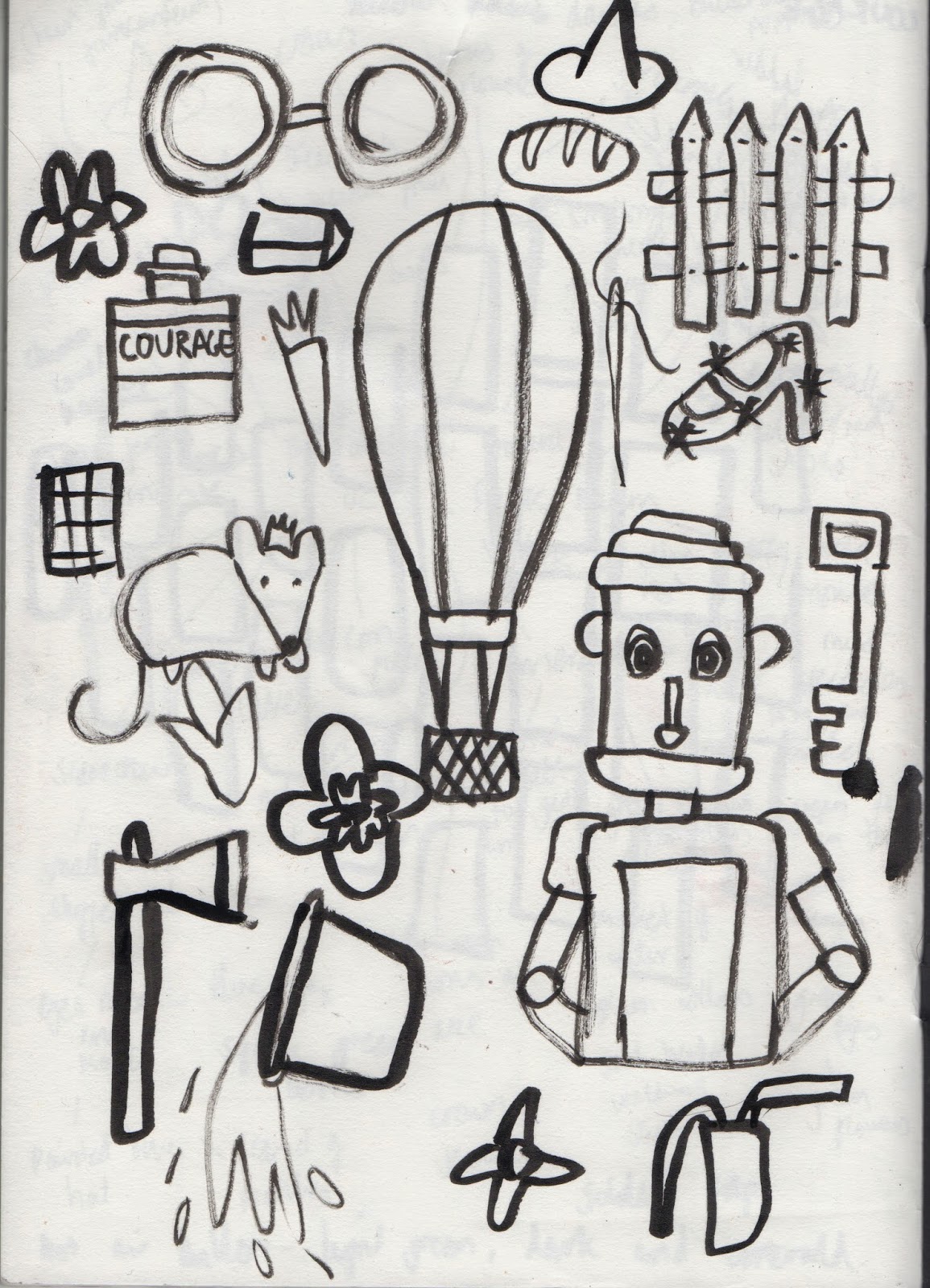
For my next book I decided to chose "The Wonderful Wizard of Oz" by L. Frank Baum. Like many of the other books, as a child I had seen the film many times, but had never actually read the book. This is one of the books that I actually properly read start to finish, as I actually quite enjoyed the story. I haven't seen the film in years, so couldn't remember anything that happened apart from the cyclone at the start, the main characters, and the horrific flying monkeys of course. The fact that Dorothy's shoes aren't actually red in the book was the biggest shock. As usual I read through the book and jotted down the imagery that most caught my attention. I'm actually really sorry about the ink drawing, but you get the idea (I hope). 


This is my final image for "The wonderful Wizard of Oz". This collage contains a lot of green, as some of my favourite parts were the descriptions of the Emerald City.

Friday, 25 April 2014

"Treasure Island" by Robert Louis Stevenson

So far most of my collages haven't been very 'boyish', so I decided to pick a book that offered imagery that would appeal to a male and female audience. "Treasure Island" by Robert Louis Stevenson is never been a book that I've particularly been aware of, the only reason I recognised the name when researching was because of Muppet adaptation that I saw as a child. I will admit that I didn't read this book, as reading about pirates and treasure islands does not interest me in the slightest, however I did do a lot of reading on the internet to get a good idea of the book. With this book the imagery was always going to be the obvious pirate themed things as I expected. Below are some quick notes and ink drawings to get me started.


I like this collage as it is slightly different to the others. Although I have been using the same printed sheets of paper that I made at the start, the colour pallet for this collage does differ to the others. I feel like the use of reds and blues does give this collage a slightly more boyish theme. I want my work to appeal to a wide audience of all ages and genders.


Monday, 21 April 2014

"Alice In Wonderland" by Lewis Carroll

"Alice in Wonderland" by Lewis Carroll has always been a book that I've wanted to read. I read this book from start to finish as I enjoyed it as soon as I started reading it. Some parts were a bit boring but being a book based on a fantasy world I found that reading about the imagery was exciting and I could imagine how I wanted some of the objects/characters to look already. Below are a few quick sketches and the majority of the original collages before I compiled them.


Sorry about the quality of these, I screen shotted them a bit too small. So far this is probably my favourite collage. The colours, strange objects and characters make the collage look bit more chaotic compared to the Jungle book collage for example.